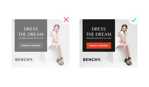
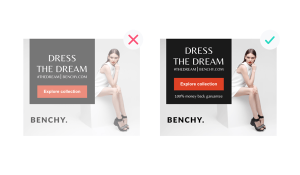
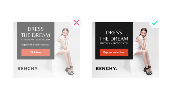
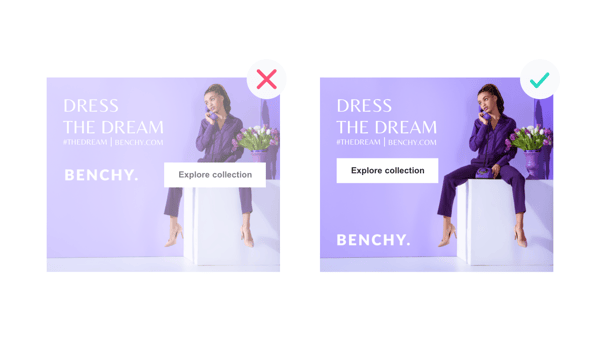
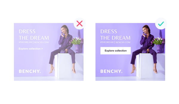
The Call to Action button (CTA) is an important element in your display ad. It has a psychological effect to it, in that it reminds the viewer that the ad is meant to be clicked. Although display ads are not known for their amazing click through rates (CTR), there is a lot you can do to generate a boost.
Display is an integral part of the online marketing mix, so if you’re spending any budget on the channel at all, you need to get your ad right. Here are 5 tips that will help you come up with a well performing CTA. If you think they’re useful, you can find more in our guide 30 tips for the ultimate call-to-action button.
And other times buttons are simply way too large. A test by Unbounce shows that a larger button had caused a 10% decrease in conversions. Yikes! Based on our experience, a button should look like a button and not be too large. Adding an arrow to your button may help, as well as a subtle animation to emphasise the button.
This blogpost is an excerpt from our white-paper: 30 tips for the ultimate call to action. Get it here.