The Facebook dynamic ad format has the potential to improve performance and solve challenges marketers often face, like ad fatigue and high CPAs.
There are many ways to succeed with Facebook dynamic ads, but one of the most effective ones is optimizing ad creatives since they impact 75% of performance. While the performance of your ad creatives depends on many different factors, well-performing dynamic ad creatives have some common qualities that can be applied to every brand.
Below, we analyzed 5 examples of Facebook dynamic ads. They each showcase some of these common qualities that can elevate your ad creatives. Since you can always improve performance by continuously testing, we also added some features they can test for all the ads to give you inspiration on what to test.
ARKK Copenhagen
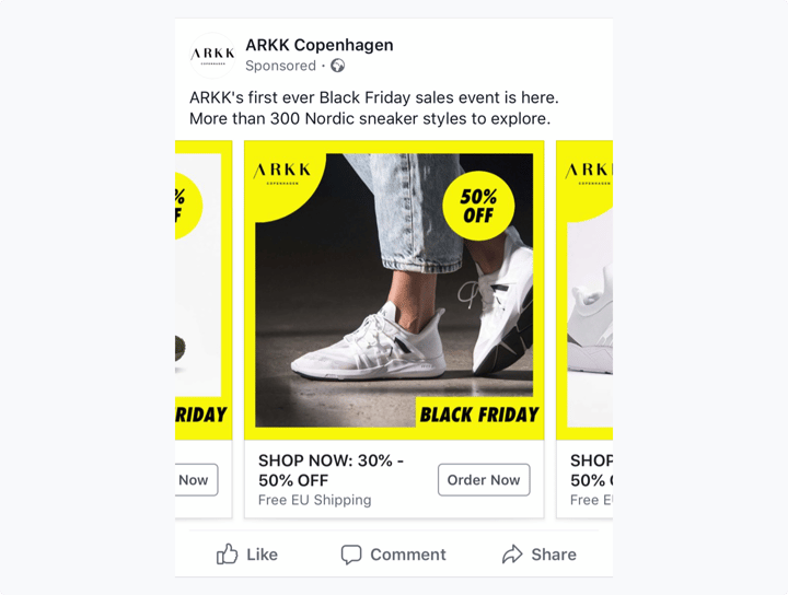
What makes this a good Facebook dynamic ad example:
- The ad creative communicates relevant seasonal campaign
The ad clearly promotes Black Friday, a crucial marketing moment for retailers like ARKK. Having campaigns during the holiday season is a great way to boost sales During and closely before moments like Black Friday, your audience is particularly alert for good deals, so make sure your offers are included in your ad creatives.
- The ad creative displays persuasive offers
The 50% sale percentage sticker ARKK has added to the creative encourages them to go to the sale page, and the offer itself is a great incentive to complete their purchase.
By adding a bright-colored frame to the ad and matching the color to other elements like brand logo and sale percentage, ARKK makes sure the ad stands out amongst a sea of generic ads with white backgrounds. Facebook is a competitive marketing platform, you want your ads to catch your audience’s attention.
What they can test to improve ad performance:
While their audience can clearly see the brand is having a sale, the price of the specific product in the ad is not shown. Adding sale price to dynamic ads could prove to be highly useful for ARKK in improving ad performance. Managing your potential customers’ expectations regarding prices from the first point of contact is likely to end in higher conversion rates.
- Copy alignment within the ad creative and text below it
The copy below the ad reads “Shop now: 30% -50% off”, while in the ad creative we only see 50%. If potential buyers click on the ad and end up on a landing page with a different sale percentage they might be deterred from taking action and leave. ARKK can use custom templates with rules and conditions to make sure the sale percentage and the product match in each ad creative.
Sunweb
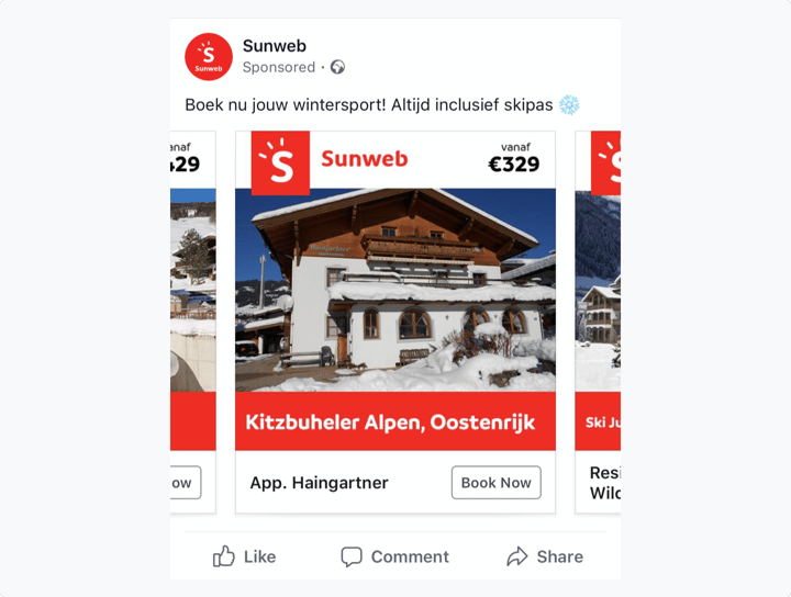
What makes this a good Facebook dynamic ad example:
- Sunweb's brand identity is reflected in the ad creative
The main focus of the creative is the holiday house Sunweb is advertising, however, their brand is also clearly noticeable without being overpowering. Adding their logo and brand colors to the creative makes the ad cohesive with the rest of their marketing and adds to their brand recognition.
- The price is clearly visible
By making the starting price for booking the house clearly visible on the ad, Sunweb makes sure their audience doesn’t get unwanted surprises after clicking through.
What they can test to improve ad performance:
- Adding offers to the creative
Giving your audience special offers is a proven persuasion technique (link to the 3 ways article). Sunweb does have an offer of a free ski pass with the booking but the offer is only clear to the people who read the ad copy. To make sure they don’t miss out on any potential customers who didn't read the text above, Sunweb can test adding the ski pass offer to their ad creatives.
In purchase decisions, especially for the travel industry, reviews from other customers play a very important role. People trust their peers more than any claim made by the brand itself. Adding user ratings to their highly-rated estates would give Sunweb the power of persuasion through social proof.
Leen Bakker
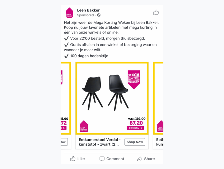
What makes this a good Facebook dynamic ad example:
- Having on-brand, consistent creatives
The ad creative is in line with Leen Bakker’s overall branding, it has the brand logo, as well as the brand colors. This contributes to having a comprehensive brand presence and increases brand awareness. The creative is also consistent with the above copy of the ad. This avoids any confusion or undesired surprises that will cause bounces for their audience.
- Having relevant and timely ad creatives
By adding visual elements about their sale week to the ad, Leen Bakker increases their chances for an even better ROI on their sale week and on their dynamic ad campaign.
- Adding both original and sale prices to the creative
Including both the original and the discounted price in the ad creative provides a good incentive to the audience to complete purchase, especially in combination with the urgency of the ‘sale week’. This way your potential customer knows the extent of the offer you’re giving them and what they would be missing out on if they don’t take action quickly.
What they can test to improve ad performance:
- Using multiple (and meaningful) product photos
Even though Leen Bakker already uses two images of the product on this creative, the second photo of the back of the chair doesn’t really give their audience anything. Experimenting with different images is likely to help you find combinations that perform better.
- Adding more offers to the creative
We can see in the text above that Leen Bakker has, even more, to offer to their audiences on top of the sale week. Putting offers like next-day delivery or a 100-day return period on their creatives might add more persuasion to their ads since people often skim the copy above and focus more on the ad creatives.
VIA VAI
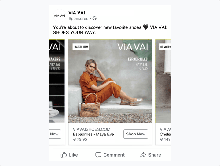
What makes this a good Facebook dynamic ad example:
- Having on-brand ad creatives
Alongside the VIA VAI logo, the ad also features a stylized product photo that is aligned with the company’s branding identity. The ad stands out, looks inviting, and adds to brand awareness.
- Adding scarcity for persuasion
By adding a ‘last item’ sticker to the ad creative, VIA VAI urges prospective customers to complete their purchases. By making it clear to potential customers that there is a limited supply of your products, you lower or eliminate purchase procrastination.
What they can test to improve ad performance:
The visual itself is appealing and on-brand but it might be hard for audiences to understand what the ad is for at first glance. And since the first glance is crucial for dynamic ads, VIA VAI can test adding images of the product alone alongside the branded visual.
- Only using offers when relevant
In other ads of this carousel, you can see some ads that say “in stock” instead of “last item” in the left corner. This is because VIA VAI’s template is in sync with their product feed and the ads only show ‘last item’ when there is indeed one item left and show ‘in stock’ if there are more. While it’s great that they use rules and conditions to match their ads with their feed, the fact that some items are ‘in stock’ doesn’t persuade the customer to take any action. What VIA VAI can test is only using statements when it’s relevant to the customer. For example, they can create a template that will show a different callout, like ‘free shipping', if there are more items in stock and only show a stock-related callout when there are less than a certain amount of items in stock.
Landal Greenparks
.png?width=720&name=landal-fb-ex%20(1).png)
What makes this a good Facebook dynamic ad example:
- Utilizing social proof for persuasion
Customer reviews play an important role in purchase decisions, especially within the travel industry. According to research by TrustYou, 83 percent of participants say that reviews and ratings play an important role in booking decisions. Adding high ratings to ad creatives, as Landal Greenparks did on this ad, is a key persuasion technique. Using templates with rules and conditions is an efficient way to generate ad creatives like these automatically. With such templates, you can add conditions like ‘add user rating to the creative if the rating is above 7.5’.
- Adding branding to the ad creative
Especially when scrolling through timelines, people typically don’t spend any more than 5 seconds on any given visual. Adding branding to your ads like Landal Greenparks did here grabs attention and helps users recognize your brand or product. Strong branding helps increase performance.
- Having consistency across all products
The image used in the ad matches the image on the landing page header. This way users immediately recognize the product and have a smooth experience
What they can test to improve ad performance:
- Showing the number of reviews
Alongside giving social proof as audience ratings, Landal could test adding to the ad creative the number of reviews that led to this score. Indicating how many users enjoyed their product before helps to add a certain weight to the score. To make sure your social proof is also bulletproof, you can add a specific condition to your ads to only show the number of reviews if it crosses a certain amount you choose, for example, +100.
It’s not possible to create templates with layered rules and conditions with the Facebook solution, but you can use a creative management platform like Bannerwise. With our solution, you’ll always make sure your ad creatives match landing pages and your product catalog and give your audience a more personalized experience.
As you can see, even though the brands above have different products and objectives, their ad creatives have common features like branding, consistency, additional and relevant information, persuasive elements like social proof, scarcity, and offers. These features can make them more relevant to their audience and stand out from the crowd.
Performance optimization is an endless process. For all of the ads above, and all ads in general, you can always test and improve. For Facebook dynamic ads, experimenting with adding price and sale price, using multiple product photos, adding relevant offers, and displaying social proof is only a few of them.
So, when you are building your next Facebook dynamic ads campaign, pay attention to the common features these examples have and keep on testing new elements to get even better results.


.png?width=720&name=landal-fb-ex%20(1).png)
